Tabs & Components
Assemble the project view from components — the construction kit behind the tabs
The project view is a construction kit: which tabs exist, what is on them and who may see what is configured by administrators under System → Projects in the Tab settings and Component settings tabs (permission Define system settings for projects). Changes affect all projects.
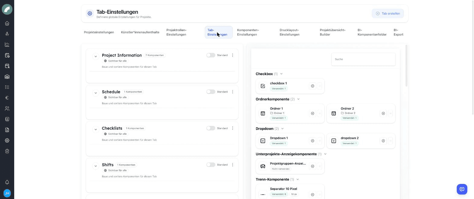
Managing tabs
- Create tab adds a new tab; name and order are up to you — the order is sorted via drag & drop.
- A tab can be marked as the default tab via the Standard toggle: it opens when someone opens a project. In addition, every tab shows its visibility ("Visible for everyone" or restricted).
- Every tab contains an ordered list of components; it can additionally have sidebar tabs — narrow sub-sections on the right (in the default setup e.g. project information, shift information, budget information).
- Folder components (collapsible containers) group components into expandable/collapsible sections.
The components
Two families:
Custom components
Freely creatable contents that are filled in per project:
| Component | Contents |
|---|---|
| Title | Heading (font size selectable) |
| Text field / text area | Single- or multi-line text |
| Checkbox | Yes/no marker |
| Dropdown | Predefined options |
| Link / link list | A single link or a collection |
| Separator component | Visual dividing line with adjustable height |
Standard components
Ready-made function blocks — each exists exactly once and is placed per tab. The most important ones:
| Component | Function |
|---|---|
| Project title / base data / project status | The project's header data |
| Project properties | Category, genre, area |
| Project team | Team list with rights and roles |
| Project group display | Group ↔ member projects |
| Calendar tab | The project calendar |
| Schedule (bulk) | Tabular bulk event creation |
| Project period | Automatically calculated time range |
| Checklist / All checklists | One specific or all checklists |
| Shift tab, shift contacts, shift info, relevant events | The project's shift planning |
| Budget tab, budget deadline, budget information | The project budget |
| Comments / All comments | Discussions |
| Documents / All documents, contracts & documents | Files and contracts |
| Artists, artist residencies | Artist data and residencies |
| Material issue | Link to the inventory |
| BI metrics | Business intelligence data |
One component, one place
The "all …" variants (all checklists, all comments, all documents) show the project's entire contents; the single variants are bound to their tab — so, for example, every craft can have its own tab with its own checklist and its own comments.
Visibility & write permissions per component
In the component settings, every component gets a permission type:
| Type | Meaning |
|---|---|
| Everyone sees & edits | No restriction |
| Everyone sees, some edit | Readable by all, write access for named users/teams |
| Some see, some edit | Read and write access only for named users |
This way the budget component, for example, stays reserved for the administration while everyone sees the short description. External users can generally access only non-critical components (custom fields, title, base data, artist names).
Recommendation: start small
The shipped setup (project information, schedule, checklists, shifts, budget, comments) covers most venues. It has proven best to create new tabs only once a department repeatedly needs contents of its own — every additional tab is one more click for everyone.
Designing a useful structure
A tab should represent one clear work context, such as communications, technical planning, or finance. Details needed almost everywhere are often better placed in the sidebar. The default tab should contain what most users need first when opening a project.
Many standard components expose connected data in a project context. The period is calculated from calendar events, the shift tab opens the global duty-roster logic for this project, and material issue links to inventory. Consider the workflow a component starts as well as its appearance.
Checking visibility
Tab visibility and component permissions work together: a person needs access to both. Specialist permissions can additionally apply to budgets, contracts, or material issues. After larger changes, check the result with a typical project-team, administration, and external-user role.
Introducing changes safely
- Define the purpose and audience of the new tab or field.
- Reuse a standard component or create a clearly named custom one.
- Assign view and write permissions deliberately.
- Place it in a clear location and test it with an existing project.
- Inform teams when names, ordering, or expected workflows change.